Yopa is an online real estate agent that sells your property with an experienced local estate agent for a small fixed fee.
Marvel prototype
The Brief

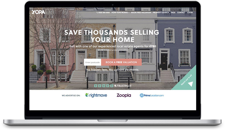
Yopa were looking for a UX Consultant to quickly flip poor conversion rates and help revamp their content strategy and branding. These objectives needed to be met before the running of a nationwide advertisement campaign.

The Challenges

Given the time frame of 6 weeks a lean strategic approach was needed, this required making effective decisions quickly as time was limited.
The Research Process

Unraveling the reasons for the poor conversion rate and high bounce rates took precedence, I had strong assumptions as to what these problems were but these assumptions needed to be validated.

Google Analytics

- The conversion on booking a free evaluation was very poor.
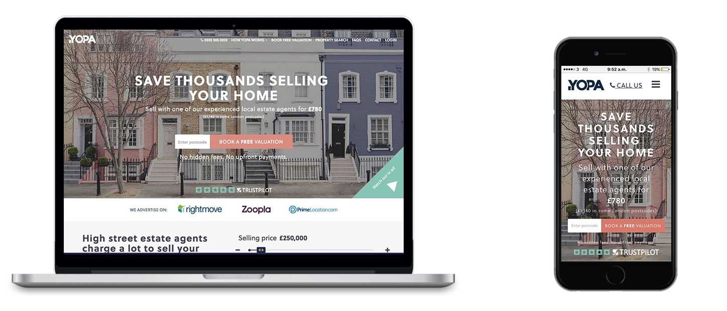
- Analytical findings on web traffic showed a 65% mobile user base.

This data informed me of what was happening on the site but wasn't telling me why.

Google analytics cartoon

Guerrilla Testing

15 qualitative user tests were performed to pinpoint usability problems, I used Usertesting.com which is an effective tool that achieves fast and effective results at a fraction of the price. This technique saved time and money and gave great insights into the behavioral patterns of users in the 30 - 65 age bracket.

Guerilla Testing cartoon

Competitor Analysis

Research was conducted on online real estate agents ranging from high end sites to middle of the road value sites, I asked myself what worked with these sites and why.

Competitor analysis cartoon

Persona Creation

I created 3 personas from the data collected from the research phase, each with varying wants and needs.

Persona 1
The First Time Seller

“I need reassurance and facts.”

Persona 2
The Experienced Seller

“I want to save money selling my home.”

Persona 3
The Mobile User

“I want a simple form thats mobile friendly.”

Execution

The execution process consisted of addressing the the as-is sign up journey, the high bounce rate, and the low conversion rate on their KPI.

Content Strategy

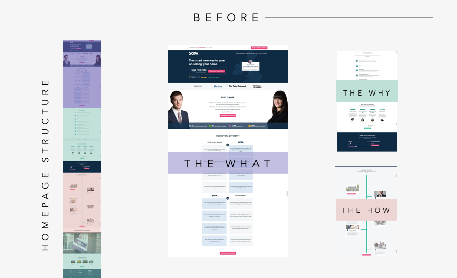
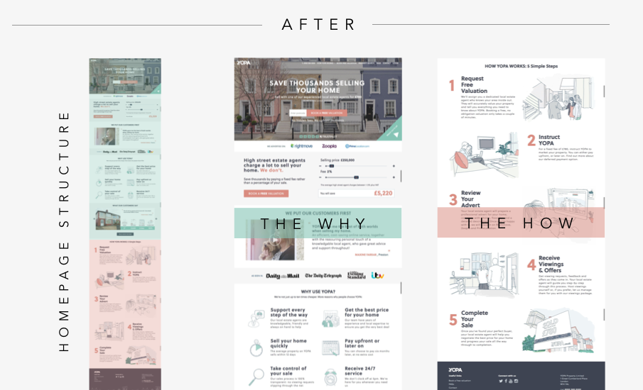
The content strategy of the homepage adhered to the Why, How, What approach (Golden Circle). This approach speaks to the limbic brain first, this is the part of the brain that inhibits trust and loyalty which are integral to making gut decisions. The homepage structure address's motivations first (why) and process second (how), the product (what) would be accessed after sign up. People don't buy what you do, they buy why you do it.

  • Mobile Design
  • Mobile Design

The Form

A prudent approach to the form resulted in the implementation of in-line form validation, clear CTA's and automatic zooming on fields, this improved conversions dramatically and enhanced the experience.

  • Hi-Fi Design

Results

The conversion on booking a free valuation significantly increased and the bounce rate was lowered. Pragmatic time management and strategic planning were the crux to the success of the project.

Competitive analysis cartoon

Lets chat!

Contact Me